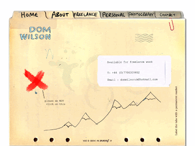
After a 3 HOUR delay, we finally got round to our feedback/crit sesh with Tom and Mike. A simple case of “show and tell” infrount of a group of about 10 students and both of the Web design Tutors. It was good to see what other people had managed to create within the same time period.
From the feedback we came to the conclusion that the level of completion of the site overall was fine. My links are working and my site is easy to navigate.
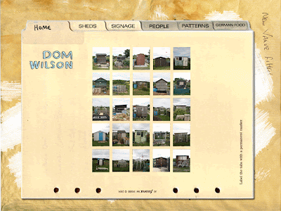
The main problem was with the way I had cropped my images, maybe I should reduce the levels of “white space” around the images. I didn’t know this was possible, so I just created a slice in fireworks that would accommodate any size, shape or orientation of image. By removing the white space around my images (by cropping them) it will help with the visual continuity of the site. Making the images appear more like they are placed on top of the folder as apposed to totally separate (on a white background).


