
Shin and Tomoko Azumi.
 On my bike ride home today I came across this delightful little minny van, used primarily for the transportation of the local O.A.Ps who live round the corner. I think you will agree it’s quite the sick ride. However it was the dynamic typeface that first caught my attention. The garish colours and piss-poor legibility make this one stunningly bad typeface, I even said to my self (in my head) that Howard (The bus driver) really should consider getting his minny van's logo and contact information re-designed. But then again, why would Howard really want/need to change anything about his vans appearance? After all he has a steady and reliable custome base (the old people who live at the center) and we all know that old people don’t tend like change, least of all a trendy new typeface on the front of Howards van! Not that they would even notice the old dears.
  Also SNAITH is the name of my East Yorkshire Village.
 POP culture penetrates the iron curtain.

 portrait of Eddie
 Dan Underwood -Artist
 Stopped off at the biscuit factory on the bike ride home today. Found these lovely little fish bottles and took some discreet photos. I think you will agree they are quite the find.
 Some of my fav fish, captured perfectly in drinks mat format.


 This is how it might look should you click on an image, click again and u return to the previous screen.
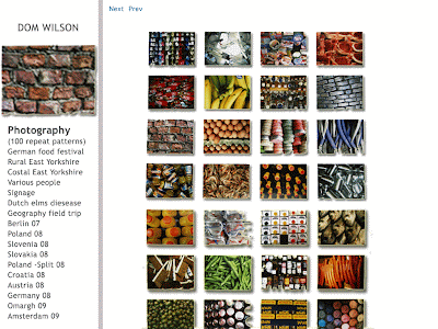 Very basic layout for the webpage, choose a catagory, in this case "photography" then choose an album under it. this will open up a quick over view of the whole album with the option of scrolling down. click an image to enlarge.
 just a few quick site i found kept me interested for more than about 30 seconds, i especially the hand-torn, home-made ruff and ready styling.

 each given 2 adjectives, from which we had to create a corp identity and company. this is part of an Add campaign for a spa/health center.
 Tame - relaxing body and mind. logo design for fake company.
 one of 4 unique master copies for the type face "univers black" had to include an example of every single character within the family.

 hand rendered type


